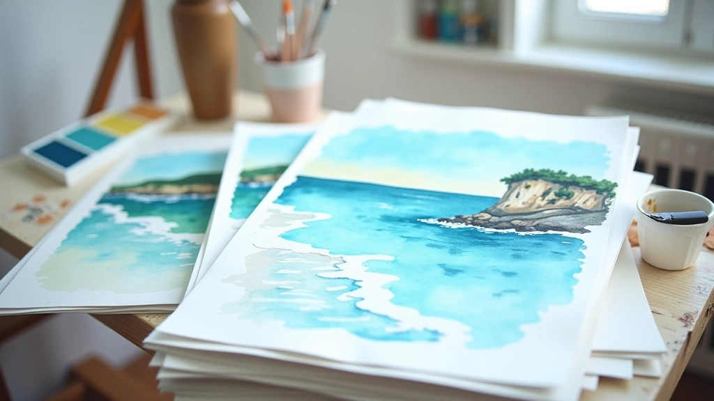
Watercolour Seascapes: Working with Water & Flow
The Atlantic coast series uses spontaneity and control in equal measure. Learn how we embrace the medium's unpredictability.
The Dance Between Planning and Letting Go
Watercolour is different from oils or acrylics. You can't just layer over mistakes and keep pushing forward. The medium demands respect — and surrender. When you're working with water and pigment on paper, you're not entirely in control. That's the whole point.
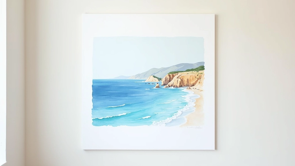
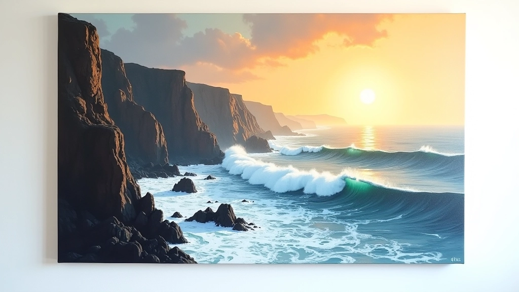
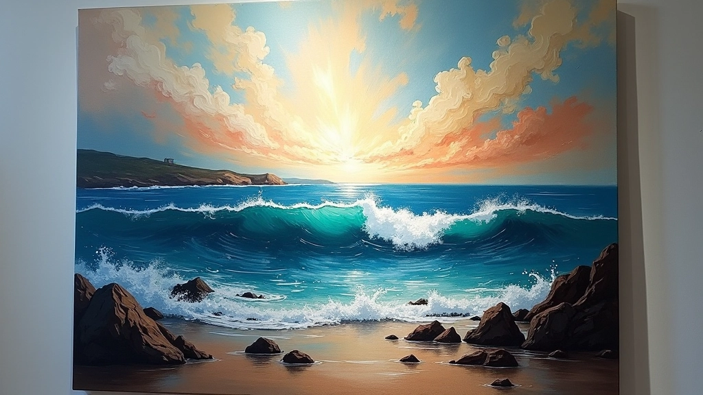
The Atlantic coast series emerged from years of watching how light hits water differently depending on the season, the time of day, the mood of the sky. We'd spend hours at the cliffs near Lagos, sketchbook in hand, just observing. The paintings that came from those observations aren't technically precise. They're honest.
This guide explores how we approach watercolour seascapes — not as a strict formula, but as a conversation between intention and accident. You'll learn the techniques we use, but more importantly, you'll understand why we don't fight the water when it does something unexpected.
Layering Wet Paper: The Foundation
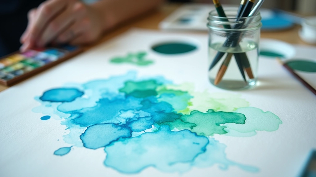
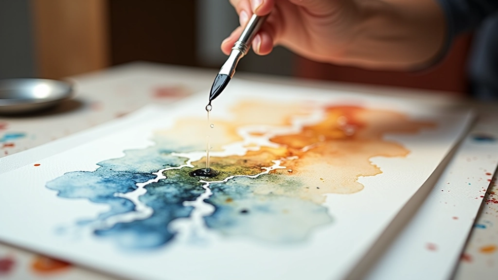
Here's where it starts. Before any pigment touches the paper, we're wetting it. Not dabbing or spraying — we're soaking the entire sheet evenly using a large mop brush and clean water. The paper needs to be wet enough that it's shiny but not pooling. This takes practice to feel right.
Why? Because when you apply colour to wet paper, it spreads. It bleeds. It creates soft edges naturally without you having to blend or soften anything. On the coast, this is perfect for suggesting fog rolling in, or how the horizon blurs when you're looking across water.
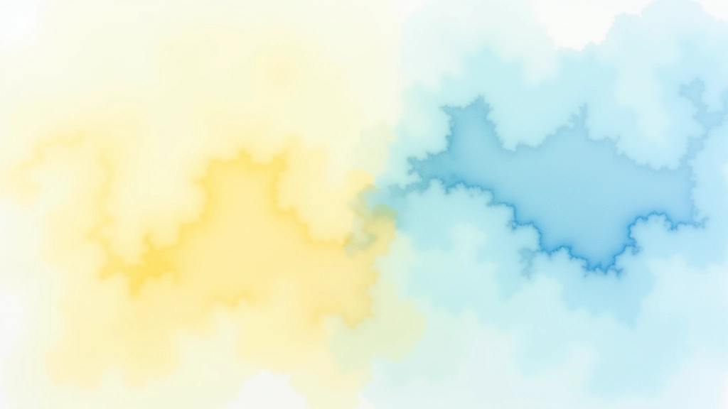
We typically work with three layers of colour. The first goes down while the paper's very wet — these are your lightest washes, the base notes. Think pale yellow for light hitting water, or a whisper of rose for sunset. You're not being precise. You're establishing mood.
The second layer comes when the paper's damp but not soaking. This is where mid-tones arrive. Deeper blues, greens that suggest depth. You've got more control here but still enough moisture that colours soften and merge.
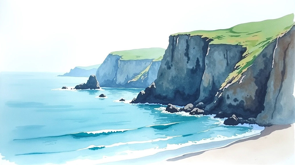
The Third Layer: Where You Actually Draw
By the time the paper's almost dry — maybe 5-10 minutes depending on humidity — you can be intentional. This is where rocks emerge. Where waves suggest movement. Where you make actual decisions about composition.
On dry or nearly-dry paper, watercolour sits on top rather than bleeding. Your brushstrokes are visible. Your edges are crisp. This is where we add depth with darks — rich indigos and deep greens that make the lighter washes sing. We're not filling everything in. We're suggesting. A few dark shapes imply an entire rocky coastline.
The challenge here is knowing when to stop. Watercolour doesn't forgive overworking. Too many layers and the colour turns muddy. Too much detail and you lose the spontaneous energy that makes these pieces alive. We typically use a 60-30-10 rule: 60% light washes, 30% mid-tones, 10% dark accents.
What's brilliant about working this way is that you're responding to what's already on the paper. The water has already made decisions for you. Your job is to understand those accidents and build on them, not fight them.
Embracing Water as Your Collaborator
The honest truth? Some of our favourite details in the Atlantic series came from happy accidents. A pigment bloom that looked like spray. A hard edge where we wanted softness, which ended up suggesting rock texture perfectly. Water does things you can't predict.
We've learned to trust the medium. If you're gripping the brush too tightly, trying to control every millimetre, the painting feels stiff. It looks laboured. But when you work with the water — letting it pool where it wants, letting colours merge naturally — something magical happens. The painting breathes.
This doesn't mean being careless. You're still making intentional decisions. You're still planning composition, value structure, colour harmony. But you're doing it within the constraints of the medium, not against them. It's like learning to sail — you don't fight the wind, you use it.
The Practical Side: What You Actually Need
You don't need expensive supplies to work this way. We've used everything from student-grade paints to professional pigments, and the technique works regardless. What matters is understanding the principle: water creates opportunity.
Paper Quality
Use 100% cotton rag paper (Arches, Saunders Waterford, Rough texture). It holds water longer and forgives lifting and rewetting. Weight matters — 300gsm minimum, preferably 425gsm. Cheaper wood-pulp paper falls apart when wet.
Pigment Selection
For seascapes, you need a range: light yellows (lemon, cadmium), warm oranges, cool blues (ultramarine, cerulean), greens, and earth tones. We rarely use more than six colours on any single painting. Limiting your palette forces interesting colour mixing.
Brush Tools
A large mop or wash brush for wetting paper (natural hair holds more water), medium round or flat for mid-tones, small round for details. Brushes don't need to be expensive — we've used basic synthetic brushes for years. They work.
The Seascape That Teaches You
Working with watercolour seascapes isn't about technical perfection. It's about conversation — between your intentions and the medium's nature, between planning and spontaneity, between control and surrender. Every painting teaches you something the last one didn't.
The Atlantic coast series exists because we stopped fighting watercolour and started listening to it. We watched how water moves, how light reflects off wet paper, how colours shift when they meet while still damp. We brought those observations into the studio and let them guide our hand.
Start with a single painting. Get the paper wet, apply your first washes, and then wait. Watch what happens. Don't rush to the next layer. Let the water do its work. That moment when you stop controlling and start observing? That's when your best seascapes will emerge.
If you'd like to explore these techniques further or discuss commissioning a seascape painting inspired by Portugal's Atlantic coast, we're always happy to discuss your vision.
About This Article
This article shares our approach to watercolour seascape painting based on years of practice and experimentation. Watercolour is a medium that responds differently depending on climate, paper type, pigment quality, and individual technique. The methods described here are what we've found effective in our practice, but your results may vary. We encourage you to experiment, adapt these techniques to your own working style, and develop your personal approach. Art is deeply individual, and the most important discovery you'll make is what works for you.